Bruno&Co
Hospitality veteran, Vito Bruno, brings a little bit of Italy to Armadale with his very first cafe.
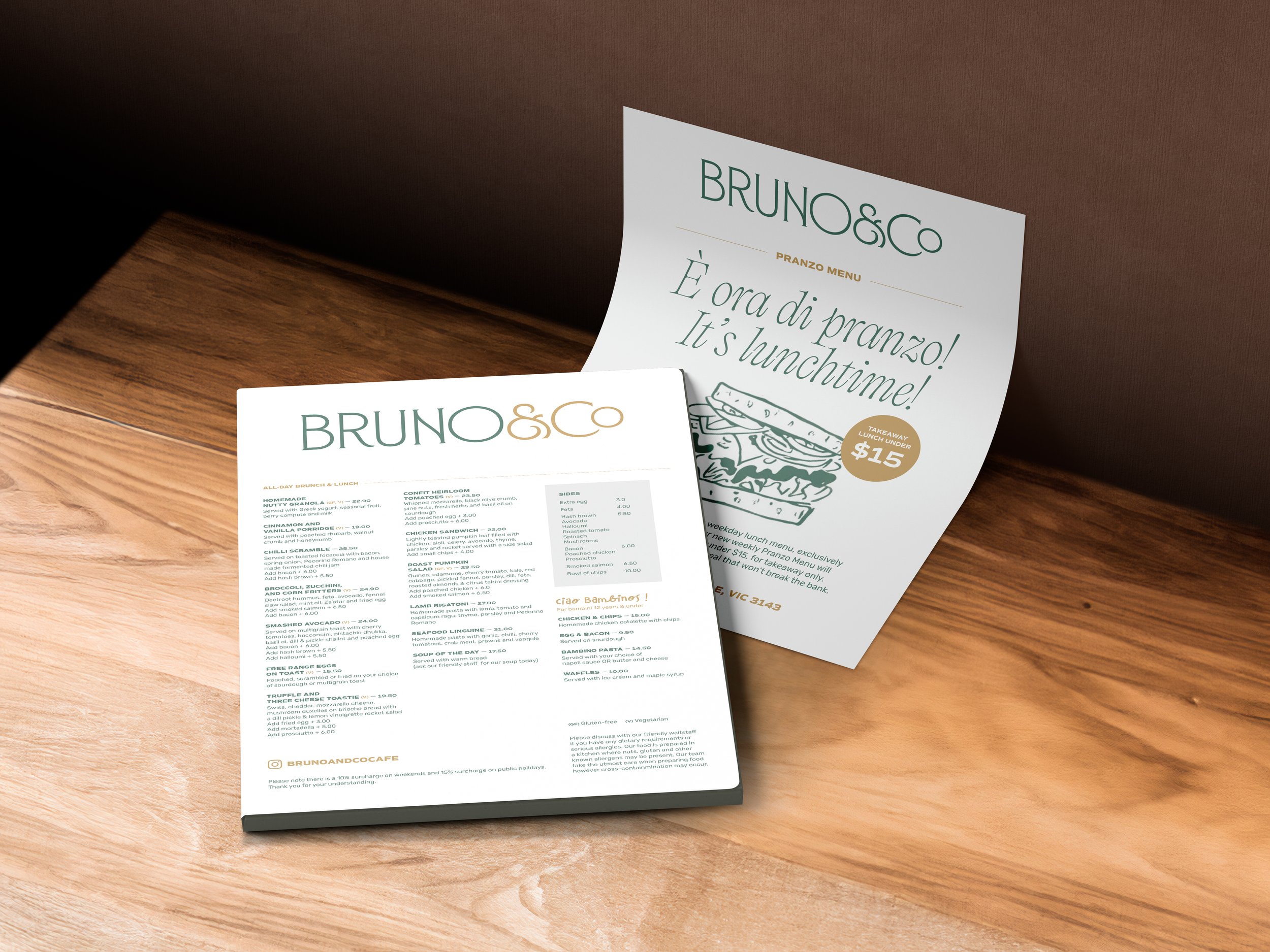
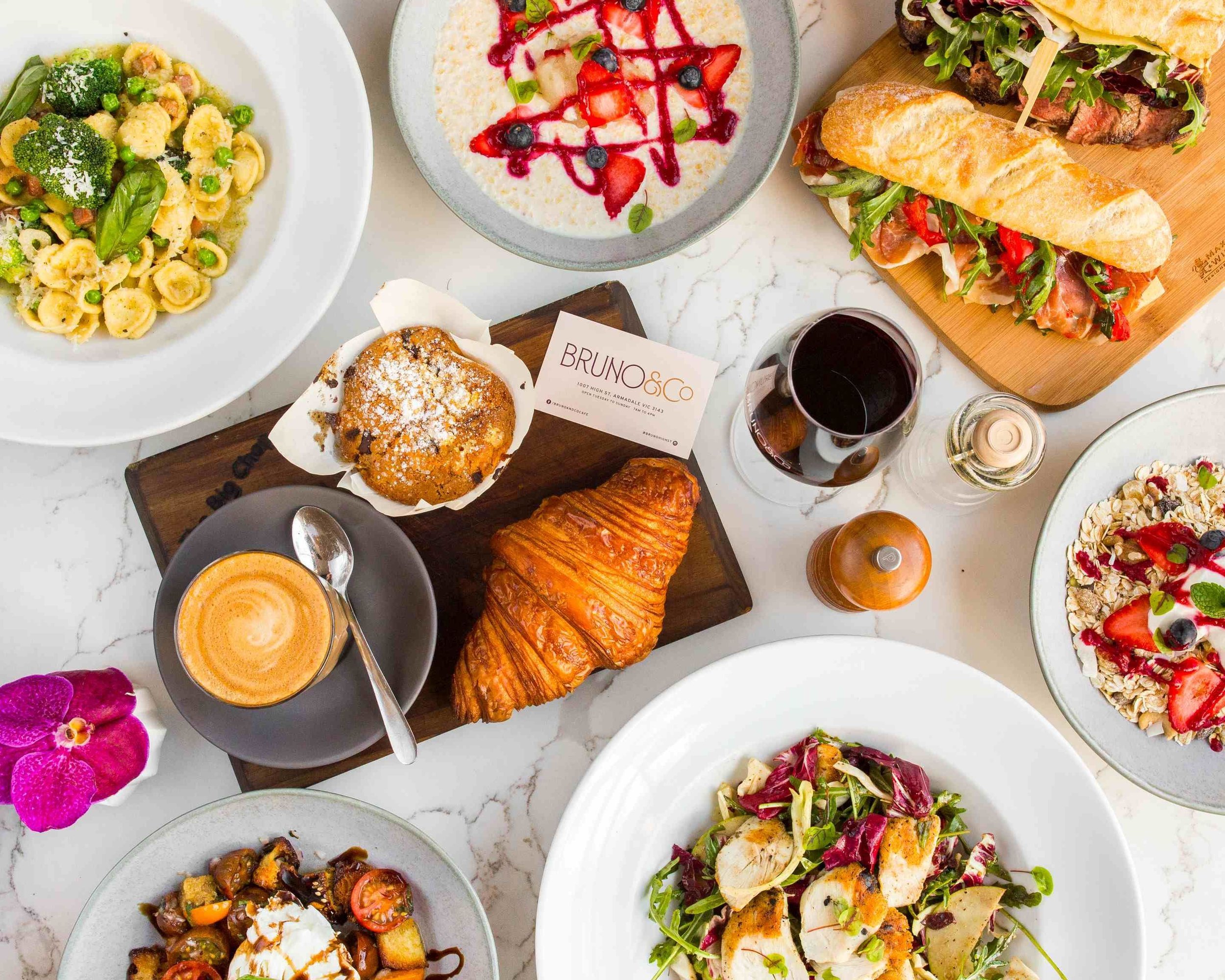
We worked with the team at Bruno&Co to develop a brand identity that reflects their deep love of food and proud Italian heritage. Since opening in 2017, the café has become a much-loved part of the Armadale community—collaborating with local businesses along High Street and earning a reputation as the go-to spot for coffee and brunch in 3143. Housed in a beautifully restored double-storey Victorian building, the space features a striking original stained-glass window, which inspired the brand’s colour palette. The logo typeface takes its cues from early 1900s Italian Stile Liberty travel posters, capturing a sense of timeless elegance and charm rooted in classic Italian design.
Services
Brand Identity
Menus
Signage
Uniforms
Credits
Photography: Bruno&Co